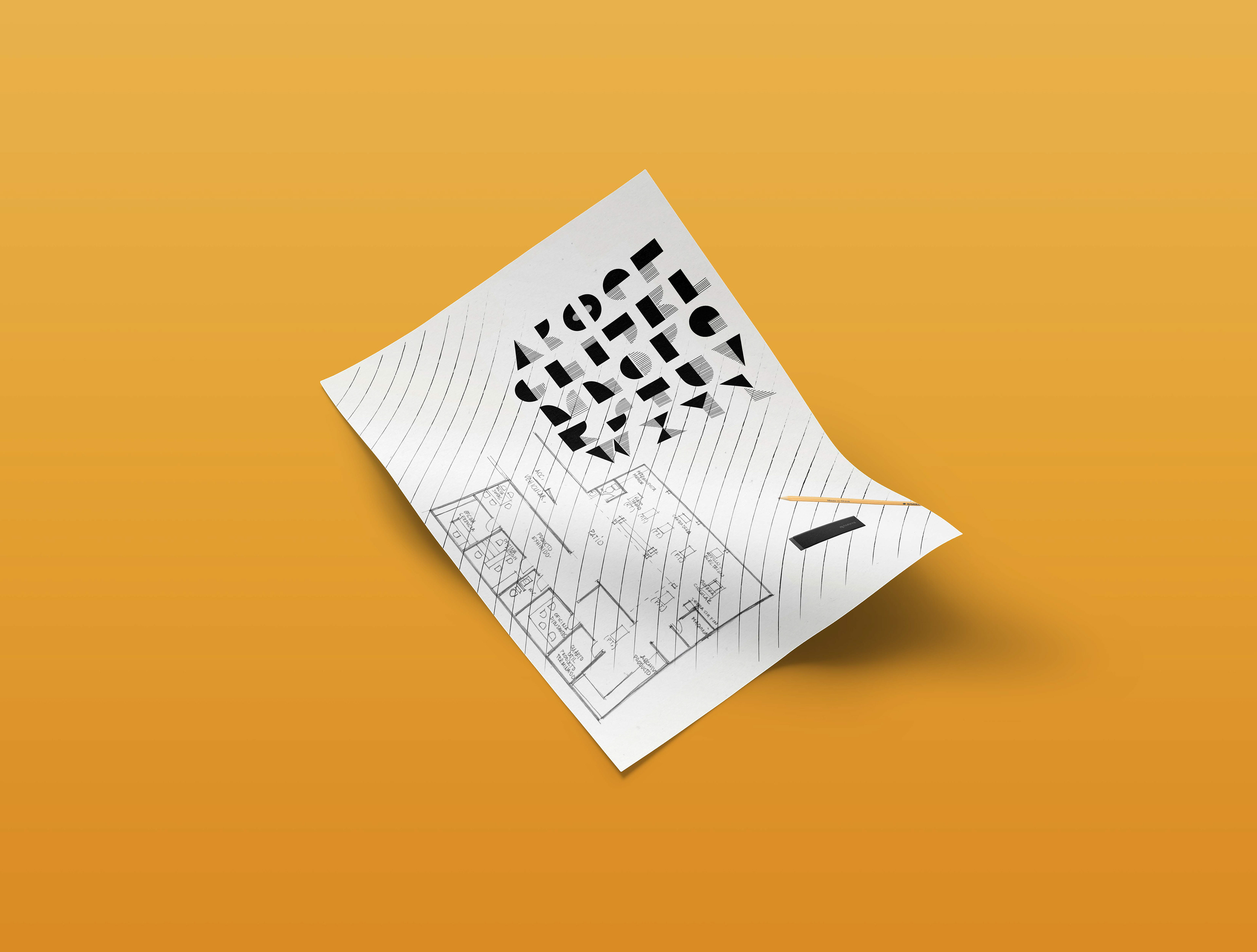
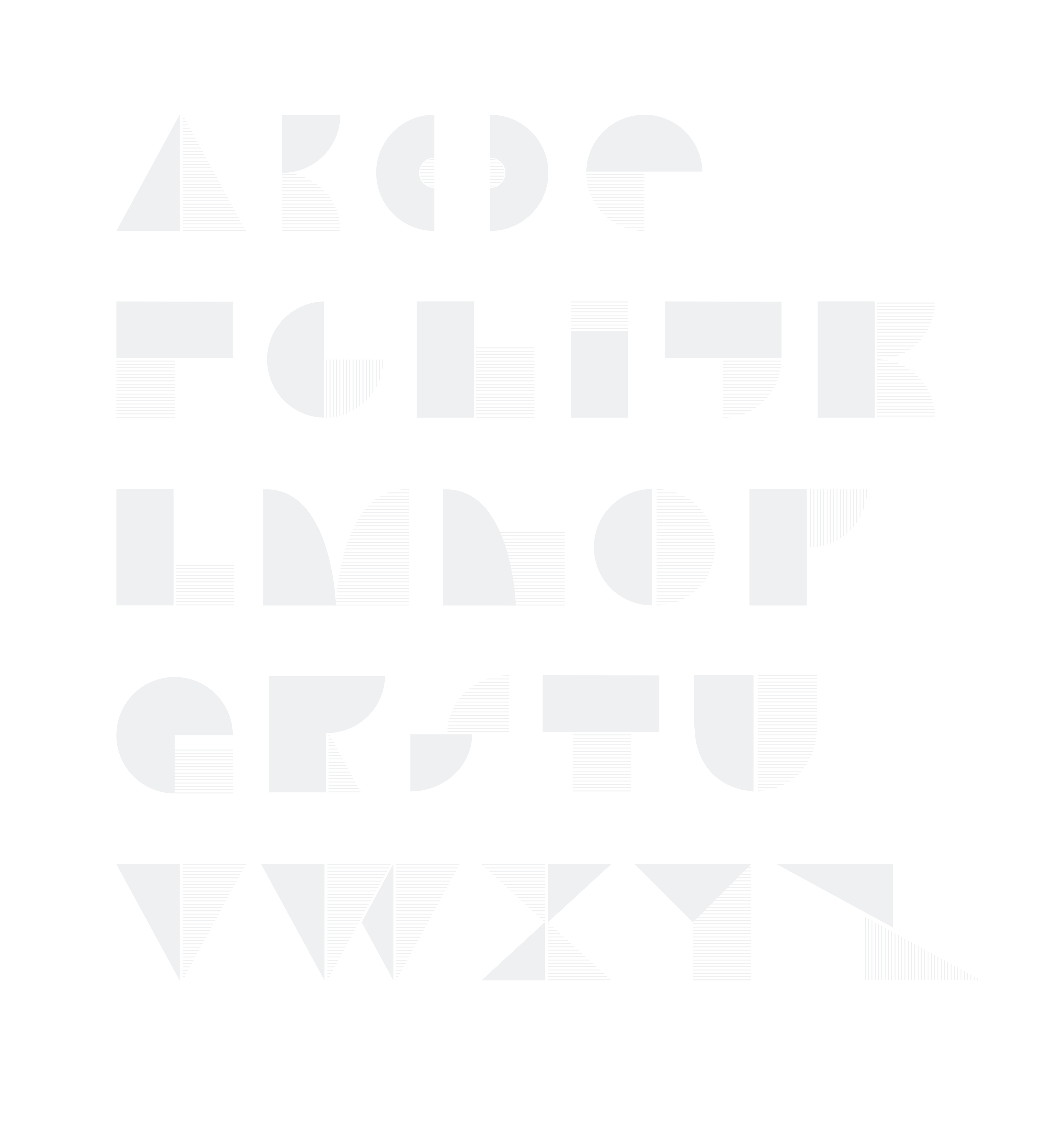
Espacio Ideal delves into a unique approach, utilizing typography as a medium to showcase architecture as a font. The distinctive design features very thin and sharp shapes intricately combined with the contrasting thickness of their accompanying elements. This thoughtful juxtaposition results in a visually striking composition that transcends the conventional boundaries of traditional fonts.
Tailored for small title text and logos, this architectural typography not only serves its functional purpose but also becomes a form of expressive design. The project represents an innovative blend of precision and creativity, where the world of architecture converges with the artistry of typography to offer a dynamic and visually compelling solution for various design applications.
Programs Used
Adobe Illustrator, Procreate
DETAILS
The architectural typography exploration was meticulously crafted using Adobe Illustrator, drawing inspiration from real-life architects and their works. This process involved constructing shapes, edges, and corners with precision, directly referencing architectural nuances. This font was meticulously crafted, drawing inspiration from real-life architectural plans the company created.


